St. Louis Cardinals unveil City Connect uniforms
The St. Louis Cardinals' uniforms have largely remained unchanged throughout their 142 year history, a standard that continues with the team's City Connect unveil on Monday. White at home and gray on the road has been the norm since 1901. The iconic "Birds on the Bat" decal debuted in 1922, becoming a staple of the Cardinals design. In recent years, St. Louis has worn an alternate cream look on Saturdays at home and an alternate blue look for Saturdays on the road.
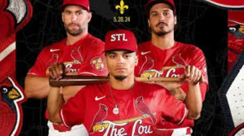
Ultimately, the Cardinals opted to stay traditional. Their City Connect design stays within the franchise's famous uniform palette, while paying homage to the history of "The Lou." The look includes a red jersey being worn in the regular season for the first time in Cardinals franchise history. In 2014, St. Louis began wearing red jerseys in spring training, but dropped it this year. White pants and a red cap complete the design.
"I think it's fine for other teams to go completely off the reservation color-wise, but I just feel like the Cardinals are held to a very high standard with their uniform," Cardinals Team President Bill DeWitt III told ESPN. "And I'm sort of proud of being, I guess somebody that's in a position to keep it that way. So I felt pretty strongly that we wanted this to feel like it was part of our portfolio of uniforms."
The Cardinals will debut the uniform this Saturday, May 25th, against the Chicago Cubs. The look will be worn 11 additional times throughout the season. DeWitt admitted to ESPN that the franchise originally had hesitancy about participating in the City Connect series, pointing to the Cardinals being a traditional club. However, seeing the success of other clubs and how fans embraced the City Connect series changed their minds.
An aspect that had to be included in the design was the "Birds on the Bat," according to DeWitt. The story dates back to 1921 and then-team manager Branch Rickey. He saw two red cardinal birds on white table cloths at a Men's Fellowship Club event at the Ferguson Presbyterian Church, according to MLB.com. Ranch pitched the idea of having it appear on the Cardinals uniform and they first did in April 1922. DeWitt said there were some mockups early on that didn't have the decal, but it never felt right. "I mean you can put every symbol you can think of from St. Louis on a jersey, it just won't feel like a Cardinal jersey if it doesn't have the birds on the bat. I just -- I couldn't get that out of my mind," he said. "We've been doing that for 100 years." A prominent part of the uniform is "The Lou'' written across the chest under the "Birds on the Bat." It's inspired by a nickname that gained popularity after Grammy Award-winning artist Nelly used it throughout his 2000 album "Country Grammar." The St. Louis native was part of the design process, appearing in the hype video. He famously rapped: "I'm from the Lou and I'm proud," on "Country Grammar (Hot S---)," the titular track of his 2000 album.
"It goes back a little further than that in terms of just a bit of a vernacular, but I think that popularized it a little bit as a nickname ..." DeWitt said. "It's not as iconic of a nickname as you might have with Bean Town in Boston or something like that. But it was definitely out there enough that we felt like it was an appropriate nickname for us to run with and have fun with." White pinstripes appear across the sleeve of the jersey, representing St. Louis' location between the Mississippi and Missouri Rivers. It's the first time pinstripes appear on a Cardinals uniform since 1929. The red "STL" cap lettering is a nod to the 1920-21 Cardinals' teams. "1882" is written on the inside of the collar to represent the birth year of the franchise. The sleeve patch is a design that pays homage to the Gateway Arch and fleur-de-lis, which commemorates the city's French heritage and foundation.
"You can't picture St. Louis without the arch, so we used it in our patch along with a traditional symbol, the fleur-de-lis, and then the STL from an old uniform from 1921," DeWitt said. "So we tried to do our patch as a nod to current iconography, past iconography and then cardinal iconography. Sort of pulled it all together in this one patch, which I thought was pretty cool."
IHSBCA Editors Note:
If the goal of this connect jersey was to stay as tradional as possible and not have anything unique then they hit the mark. This just looks like a rip off of the latin themed jerseys done in the past with Los in front of the team names. However, lets work top - down on this. The hat, just an STL. It reminds me of a NYFD (New York Fire Dept) hat. The jersey, very basic. I do like the sleeve patch though. When you think of St. Louis I think of the Arch and that is the only place on the jersey that has the Arch. When it comes to the jersey itself, I actually don't mind the "The Lou" across the chest. A nod to Nelly which means they are trying to "connect" to the youth of St. Louis which is good. BUT...... be a little creative on the rest of the jersey look.