Major League Baseball's City Connect uniforms, which launched in 2021, have done exactly that. Nike has worked with MLB teams to create a uniform that reflects each baseball city's culture and community, similar to the NBA's city jersey series that began in 2017.
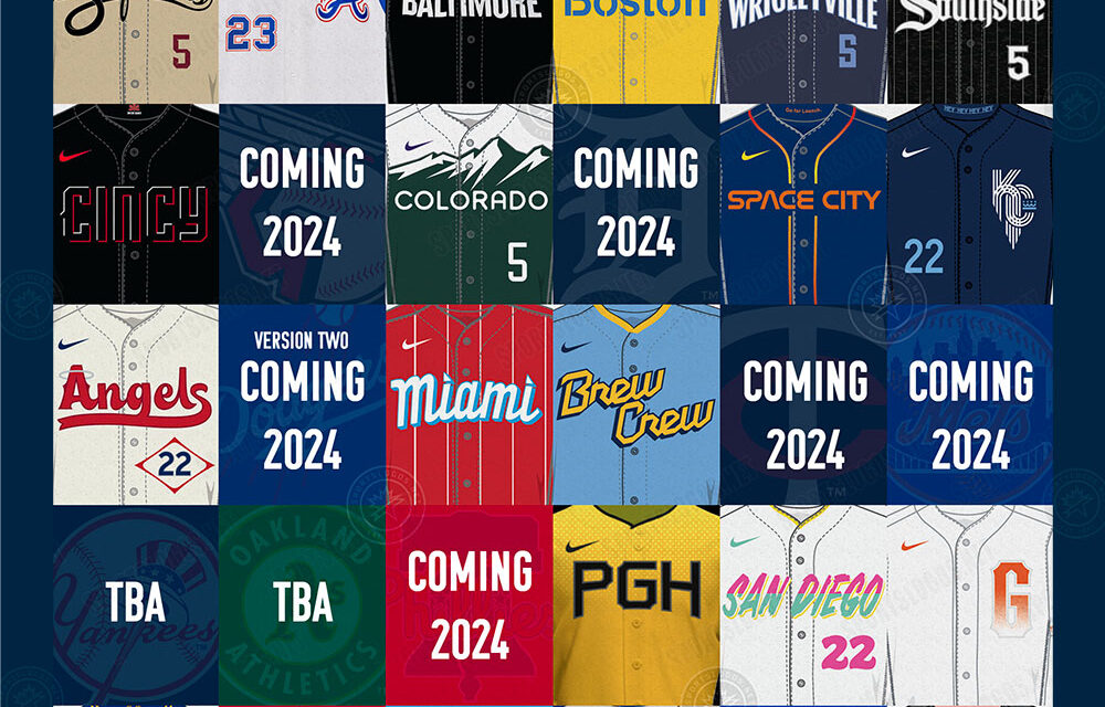
There were 20 uniforms released prior to this year, with nine more to be added during the 2024 season -- starting with the Philadelphia Phillies (April 12) and followed by the New York Mets (April 27), Tampa Bay Rays (May 3), Detroit Tigers (May 10), Cleveland Guardians (May 17), St. Louis Cardinals (May 25), Toronto Blue Jays (May 31) and Minnesota Twins (June 14). We'll also get another set this season from the Los Angeles Dodgers (June 21), which will make them the first team with two City Connect looks. After this new batch arrives, the New York Yankees and Oakland Athletics will be the only teams without one.
Here's our breakdown of the uniforms that have dropped to date, including grades for each design by ESPN MLB writer David Schoenfield. We'll continue to update the list as new City Connect unis are unveiled.

2024
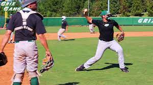
New York Mets
Debut: April 27, 2024
Design inspiration: The Mets wanted to create a uniform that not only related to fans of the team but captured the connection to New York City as a whole, leaning heavily on the "NYC" across the chest to represent "a city like no other." They pay homage to New York's subway stations with multiple design elements, most specifically purple flourishes representing the 7 line, which stops at Citi Field. There's also the Queensboro Bridge, which connects Manhattan and Queens, across the cap.
Editor Note: I'm not sure how I feel on this design. Color scheme and look screams New York, but I don't get the purple aspect of the uniform. However, it screams more Yankees then it does Mets and not just with the dark colors. The Mets are in Queens, New York. I think airport more than bridge. I'm torn on whether to like or not with this one. C+/B-
More: Mets go with "NYC" to connect to whole city, rather than just one area »
Philadelphia Phillies
Debut: April 12, 2024
Design inspiration: The Phillies' style goal was to be "unapologetically Philly." The blue and yellow colors are inspired by the city's flag and the blue collar of the jersey is meant to represent what the Phillies say is Philadelphia at its core: "a blue-collar big city with a small-town feel."
Editor Note: F. I just don't like at all. Of all things about Philadelphia the flag is not what I would think of. How about Rocky or anything to do with the Revolutionary War. I can get on board with the color scheme but the font that is used for the PHILLY looks like something for Halloween. This is a fail for me.
More: Phillies' City Connect unis include nods to Liberty Bell »
2023
Pittsburgh Pirates
Debut: June 27, 2023
Design inspiration: Pittsburgh's black-and-yellow combination is a nod to the city's bridges and its shift from the steel industry to medicine and technology. Each letter in "PGH" includes a texture from the Roberto Clemente Bridge, which connects downtown Pittsburgh to PNC Park.
Editor Note: This one is an A- grade for me. The Steele City is black and gold, heck every pro sports team has those colors. I might have gone with an old yellow uni like the Savannah Bananas but the look is ok and safe. Not sold on the PGH, would have gone with Steele City.
More: Bucs nod to Pittsburgh's landmarks, blue-collar mentality, thriving technology »
Baltimore Orioles
Debut: May 26, 2023
Design inspiration: The all-black look includes "Baltimore'' across the chest, written in a font inspired by the Globe Collection and Press at Maryland Institute College of Art. It also has the "You Can't Clip These Wings" slogan, a melody created by Baltimore-based poet and author Kondwani Fidel intended to embody the city's perseverance.
Editor Note: Call me crazy, but I like the all-black look. I might have gone with Francis Scott Key and our National Anthem as the inspiration since that happened just outside of Fort McHenry in Baltimore, but with today's political climate I could see why they stayed away from that. Wish they would have included some purple for the Ravens though. Otherwise, this is an A.
More: Orioles' City Connect uniforms celebrate Baltimore's many neighborhoods »
Cincinnati Reds
Debut: May 19, 2023
Design inspiration: Cincinnati focused on the growth of its city in recent years. The Reds included multiple modern takes on traditional aspects of their uniforms -- a revamped "C" logo and all-black look with red accents, different from their typical red and white.
Editor Note: Again, love the All-Black look and man does that red pop on this one. One downside to this is that is isn't very different from the regular uni's. I still give it an A+. Give me a red belt and it would really pop.
More: Reds put modern spin on one of baseball's oldest franchises »
Seattle Mariners
Debut: May 5, 2023
Design inspiration: Throwbacks. The "Seattle" font across the chest is similar to that of the Seattle Pilots, the original MLB team in the city, while the black pants are a nod to the Steelheads, a Negro League team. The trident logo has been used in the past by the Mariners, notably in the 1980s and late 2010s.
Editor Note: A- here, love everything about this uniform. Hat the black pants though. The black pants screams 11U travel baseball to me and I waiting for a parent to pull out a speaker and play walkup songs at the Mariner's away games. The trident is awesome.
More: Mariners bring back a familiar logo with City Connect uniforms »
Texas Rangers
Debut: April 21, 2023
Design inspiration: This is a design packed with Texas tributes, from its "TX" logo to numerous references to Lone Star State history. There's even a "peagle" patch, which combines the mascots of the minor league Fort Worth Panthers and Dallas Eagles.
Editor Note: B. There is nothing that I really like with the uni. Then again, there is nothing that I really hate. It is OK. However, can something be just ok? I do like the off white jersey.
More: Rangers feature something called a "peagle" on City Connect uniforms »
Atlanta Braves
Debut: April 8, 2023
Design inspiration: Hank Aaron. The look is an update of the Braves' uniform from 1974, the year Hammerin' Hank passed Babe Ruth as baseball's all-time home run king, and features other Aaron-inspired touches throughout.
Editor Note: A, if the inspiration is Hank Aaron then they hit the mark. I think of the 1970 Atlanata Braves with this uniform. The reason why it isn't an A+ is because it looks like a 1970's Braves uniform, what is different about it. What makes it special. But it does like nice.
More: Braves pay special tribute to Hank Aaron with City Connect uniforms »
2022
San Diego Padres
Debut: July 8, 2022
Design inspiration: According to the Padres, the bold departure from their regular uniforms "mixes iconic California imagery with the vibrant colors of the Baja peninsula."
Editor Note: I just don't get it. Not at all. I don't see Southern California, unless you are talking Mexico and maybe that was the idea. I see South Florida (the Marlins). A colorful look would be ok, but not those colors. If they are going colorful, go Beach Boys vibe and skater vibe. I just don't see it. D+.
More: Padres use vibrant shades of pink, mint and yellow colors for City Connect unis »
Milwaukee Brewers
Debut: June 24, 2022
Design inspiration: The Brewers took their nickname -- "The Brew Crew" -- and etched it across their chest, while the inclusion of a baseball grill patch on the sleeve is a unique nod to Milwaukee's fans.
Editor Note: A/A+, I think this is a winner. Love the Grill on the sleeve. It is missing a bratwurst, though. If I had to nit-pic here, instead of a navy/yellow stripe on pants go with a powder blue/yellow stripe. And put "Crew" on the helmet. Go full men's slow pitch softball here.
More: Brewers honor Milwaukee's summer skies, grilling culture and Lake Michigan »
Los Angeles Angels
Debut: June 11, 2022
Design inspiration: The beach. The Angels' lettering across the chest, with a fishtail flourish, is inspired by surfboards.
Editor Note: More traditional then I would like, but I do like it. I'm a fan of the off-white uniform, makes me think to old-school baseball. The could have been more crazy with the hat. A- here, need a little style........ it is LA, of course.
More: Angels nod at local surf and skate culture with City Connect unis »
Colorado Rockies
Debut: June 4, 2022
Design inspiration: The DMV. The Rockies turned their uniforms into a baseball jersey adaptation of Colorado's license plates.
Editor Note: A+, finally the Rockies have something to be proud of. Love the look, especially the one that is pictured above. They also go with a green colored pant, which I saw in-person and I perfer the white. The green works, but wouldn't some ice blue color look better? However, it is a good look.
More: Rockies mix hints of pine trees, skiing and sunshine for their City Connect unis »
Kansas City Royals
Debut: April 30, 2022
Design inspiration: The most notable element of the jersey -- the logo -- takes cues from Kansas City's official flag.
Editor Note: I give this a B. Not bad, I get the elements they were going for, especially the waterfall at Kaufmann Stadium in the KC logo. But the MLB missed a great opportunity to connect with the Negro Leagues (Negro League museum is in KC) and have a throw back uni to honor them. Thinking the Clowns.
More: Royals' unis connect to Kansas City's sporting and architectural history »
Houston Astros
Debut: April 20, 2022
Design inspiration: Outer space. The Astros lean into Houston's most well-known explorers -- NASA -- with many elements, most prominently the "SPACE CITY" name stenciled across the chest in what the team called a "space-inspired" font.
Editor Note: A. Definately think NASA or space with the design. But could they not use the OXY sponsorship on this jerseys. Maybe TANG. Only things that could be better is if they were dressed like a trash can........... too soon?
Washington Nationals
Debut: April 9, 2022
Design inspiration: Cherry blossoms. Among other symbols of the nation's capital, the Nats decorated their jerseys to celebrate D.C.'s iconic cherry trees, though they'll be retiring the look after the 2024 season.
Editor Note: B, I just don't get it. Cherry Blossoms? The look is just fine, but why don't they put George Washington's face on the sleeve since he chopped down a cherry tree. Here is another example of a missed opportunity to do something iconic with the history (literally history) of Washington DC. I'm not from the area, so many cherry blossoms is a big thing there. Anyone from the DC area and can let me know?
More: Nats, Wizards unveil cherry blossom-themed uniforms »
2021
Los Angeles Dodgers (Take 1)
Debut: Aug. 20, 2021
Design inspiration: The "Los Dodgers" lettering on both the hat and jersey is not only a shout-out to the team's Latin fan base, but was also a specific callback to "Fernandomania," when Mexican left-hander Fernando Valenzuela burst onto the scene 40 years earlier, winning the National League Cy Young Award, Rookie of the Year Award and, oh yeah, the World Series in 1981.
Editor Note: F. Flat out terrible. What is different ("LOS")? If I do recall, they already make a jersey like that. They just dropped the ball here, there is so much that the Dodgers could have used for inspiration. Fernando is from Mexico and a Mexican icon, this is the team that could have used Mexico's colors to honor Fernandomania.
More: L.A. unveils 'Los Dodgers' City Connect uniforms »
San Francisco Giants
Debut: July 9, 2021
Design inspiration: Fog. San Francisco's offering in the City Connect series has graphics that are emerging from the city's famous fog, including its most well-known landmark, the Golden Gate Bridge.
Editor Note: C+. I get it, the golden gate bridge is painted oranage and that is why they used the color. But oranage and white....... boring. And that "G", not a fan. I do like the bridge in the logo. They missed the boat with the color scheme and the G. Maybe they could have incorporated Alcatraz and used a charcoal grey or black too.
More: Giants' City Connect uniforms feature Golden Gate Bridge, fog gradient »
Arizona Diamondbacks
Debut: June 18, 2021
Design inspiration: The Diamondbacks become the "Serpientes" on their City Connect jerseys, a nod to Hispanic culture, and their choice of gold is straight out of the Arizona desert.
Editor Note: B+ The desert-sand jersey color does stand out and using the "Serpientes" does hit the Hispanic culture. What they have does hit the mark with what inspired the uniform, but they could have used something else for inspiration. Overall, not bad though.
More: D-backs unveil gold jersey, referencing Sonoran Desert, Hispanic culture »
Chicago Cubs
Debut: June 12, 2021
Design inspiration: With colors that evoke their city's flag, the Cubs' look prominently features the "Wrigleyville" neighborhood that surrounds their iconic ballpark, in a font similar to Wrigley Field's famous marquee.
Editor Note: A/A+. This editor hates the Cubbies, but I have to say this is a good look. Maybe add a little bit of red in the jersey since there is red in the city's flag. So, I have to say it "Cubs Win, Cubs Win!", Fly the W.
More: Cubs' uniforms feature 'Wrigleyville' across the front in marquee font »
Chicago White Sox
Debut: June 5, 2021
Design inspiration: The first of the Chicago City Connects takes cues from the city's Greystone architectural style as well as hip-hop and youth culture, highlighted by a Gothic "Southside" across the chest to represent the team's long history of calling that part of town home.
Editor Note: A+. Not my cup of it and I wouldn't buy this jersey. That said, I don't think there is anything else that could sream the South Side of Chicago more then this uniform.
Miami Marlins
Debut: May 21, 2021
Design inspiration: Miami's Cuban population is celebrated with a uniform inspired by the Sugar Kings, a Triple-A team that played out of Havana, Cuba, from 1954 to 1960. The sleeve patch uses the original Sugar Kings logo, with an "MM" added to the crown.
Editor Note: A. I love the top because when you see these, you know you're watching the Marlins. It certainly feels a lot more Miami than the Marlins' uninspired regular uniforms.
More: Marlins' uniforms to honor former Cuban Triple-A team the Sugar Kings »
Boston Red Sox
Debut: April 17, 2021
Design inspiration: The Red Sox launched the City Connect series with a radical idea: No red. Instead, the team went with a yellow-and-blue jersey color combo that's a nod to the Boston Marathon. There's also a sleeve patch featuring Fenway Park's "617" area code.
Editor Note: A+. I'm not giving this grade because I'm a Red Sox fan (which I am) but this is perfect to represent the Boston Marathon. It does give off a UCLA vibe with the B on the hat/helmet. I would have changed that look, but the rest of it is perfect.
Feel free to give us your comments on the City Connect Uniforms below