Over the years, baseball uniforms have taken many different twists and turns from being very basic white and gray to the outlandish White Sox uniforms that had a collar and shorts for pants. One unique style that has come and gone and come back again has been the powder blue jerseys, also known as the Baby Blues. It seems that the Blues have people either loving them or hating them, it is kinda like Taylor Swift and Travis Kelce, but that is a different sport. So, when did the powder blues hit the scene in major league baseball? Who were the forward thinking teams that decided to go this controversial route.
The history of baby blue MLB jerseys is intertwined with the evolution of baseball uniforms and fashion trends within the sport. In the early years of baseball, teams typically wore simple, monochromatic uniforms without much variation in color. White, gray, and sometimes pinstripes were common choices for both home and away uniforms. As the sport grew in popularity and teams began to adopt more distinct identities, uniform designs evolved to incorporate team colors and logos.

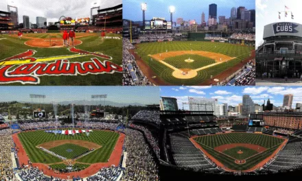
In the mid-20th century, teams began experimenting with more colorful uniform designs, including the use of bright colors such as baby blue. Contrary to popular belief the Phillies were not the first powder blue jersey, the first powder blue road uniform was not unveiled in the 1970s or 1980s. In fact, it was the 1941 Chicago Cubs who rocked a new shade of blue gear. The 1941-42 Cubs wore a blue’ish-grey colored pant and vest, with royal blue sleeves. They quickly went back to the traditional grey in 1943. Unfortunately, Chicago gets the dubious distinction of having the two worst powder blue uniform looks. Reverse pinstripes? Who thought that was a good idea? The Cubbies may have been the first to introduce powder blue, but they were far from the best at making it work. Sorry Cubs fans, you’re last…again.
A few years later the Brooklyn Dodgers went with powder blue, and they added a thick white racing stripe down the shoulders and sleeves. For one season only, the Dodgers hit the road in bright satin powder blue pants and jerseys. These uniforms were specifically made to look good under the shiny new lights for night games. They were, however, a little too shiny. In 1945, the Dodgers tried a darker blue version, before dropping the satin roadies for good. After the Dodger debacle, the powder blues went away for a while.

In 1969, a new round of expansion hit both the American and National League. And two of these new teams – the Montreal Expos and Seattle Pilots – played their first road games in powder blue flannels. Both teams started their existence on shaky ground, likely a big reason why they were willing to take a chance on powder blue. One would weather the storm and the other would not (the Pilots moved to Milwaukee and became the Brewers for the 1970 season). But, the die had been cast and - with the help of one more revolutionary movement – powder blue would invade grey’s space as the “king of the road.”


Baby blue jerseys started to appear in MLB again as teams sought to modernize their looks and appeal to younger fans. Some teams, such as the Houston Astros and Kansas City Royals, adopted baby blue jerseys as part of their regular uniform rotation during this time period.
By the time the decade was over and the 80’s were starting up, no less than 11 major league teams were wearing powder blue on the road. The 1980s marked the peak of popularity for baby blue jerseys in MLB, with several teams incorporating them into their uniform sets. Baby blue jerseys became synonymous with the era, representing the vibrant and colorful aesthetic of 1980s baseball. This included the Blue Jays, Twins, Rangers, Brewers, Royals, and Mariners of the American League, along with the Braves, Cardinals, Phillies, Cubs (powder blue with white pinstripes!), and Expos in the National League. As fashion trends evolved and teams updated their uniform designs, the popularity of baby blue jerseys waned in the 1990s and early 2000s. However, in recent years, there has been a resurgence of interest in retro and throwback uniforms, leading some MLB teams to reintroduce baby blue jerseys as part of special alternate uniform sets or as part of throwback nights.
Today, baby blue MLB jerseys have become iconic symbols of nostalgia for fans who remember the colorful uniforms of past decades. Additionally, baby blue jerseys have gained popularity among younger fans and fashion-conscious individuals who appreciate the vintage aesthetic and unique color palette. Overall, the history of baby blue MLB jerseys reflects the evolution of baseball uniforms and the enduring appeal of retro fashion in the sport. While they may not be as prevalent as they once were, baby blue jerseys continue to hold a special place in the hearts of baseball fans and remain a cherished part of MLB's sartorial history.
Here is a Link to some modern Baby Blues
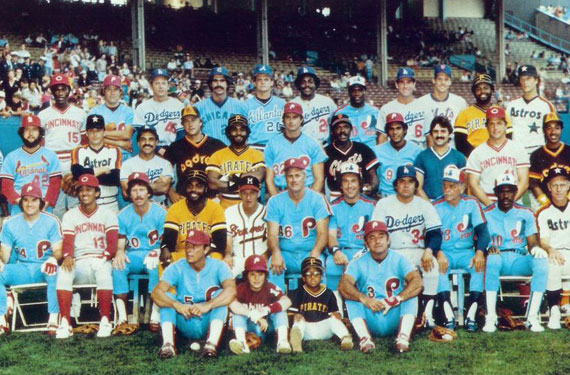
Here is a list of some of the most ICONIC "Baby Blue" uniforms in MLB History
(In no particular order)
1982 Milwaukee Brewers
When you think of baseball powder blue uniforms, most immediately think of Harvey’s Wallbangers in 1982. They combined offensive prowess, the league MVP, and, to top it off, both Robin Yount and Rollie Fingers provided fans with some of the best mustaches in baseball history. The yellow and two shades of blue just pop together, and you can’t beat that ball-in-glove logo. Just a side note, the Brewers franchise actually started out in powder blue uniforms because the Seattle Pilots wore the color in their only season before moving to Milwaukee.

1985 Kansas City Royals
Bo knows a lot of things, including how to rock powder blue. Those Royals teams were fun to watch with George Brett, Brett Saberhagen, and Hal McRae. The ’85 Royals beat St. Louis Cardinals in the World Series most likely because the Cards chose to ditch the powder blue they wore in 1982. It's not scientifically accurate, but it’s the story. Obviously the popularity of this look prompted Kansas City to bring back powder blue alternate uniforms in the last few years. Powder blue is now an official secondary color for them.

1986 Montreal Expos
Does anyone else watch the Nationals and still think of them as the Expos? Tim Raines, Andre Dawson, Gary Carter, and a young Randy Johnson all wore Montreal’s light blue threads with the blue and red racing stripes. Most people still think of this look when the Expos come to mind. I’ll be honest, the Expos powder blue look is better than anything the Nationals have worn since they moved to the nation’s capital back in 2005.

1980 Philadelphia Phillies
Mike Schmidt and Pete Rose wore these, and the original versions actually had zippers instead of buttons. The Phillies current look is so classic, that many people forget about the maroon and baby blue days. The cool number font helps with the look, but since Philly has won more in their current look, don’t expect to see these come back any time soon. They might make a cool alternate, though.

1982 St. Louis Cardinals
Willie McGee might have been one of the ugliest baseball players in the history of the game, but he still looked good in that powder blue! The 1982 World Series between St. Louis and Milwaukee featured two teams with light blue road uniforms. That’s something that will clearly never happen again. It was so 80s, and so awesome!

1993 Toronto Blue Jays
Oh Canada! Joe Carter, the bomb heard around maple country. Toronto tried to bring these back as an alternate, but it didn’t seem to catch on. The great thing about Toronto’s powder blues is that it influenced the 90s look, which is similar to what is worn today. The custom font is great, and the Jays logo has always been a favorite.

1983 Atlanta Braves
Dale Murphy and the Atlanta Braves went with a bland powder blue look in the 80s. Today’s Braves wear a road cap similar to the ones worn in the powder blue era. It was trendy, but this is by far the worst look the Braves have ever had. Even the Hank Aaron uniforms, with the feather on the sleeve, looked more distinctive than these.

1980's Seattle Mariners
Seattle had its second powder blue phase after the Pilots skipped town for Milwaukee. Complete with racing stripe, I enjoyed this look, but it always seemed like they were just trying to pull what was popular from everyone else. The Mariners current look is, by far, its most iconic. The resurgence of teal has supplanted the desire to ever see powder blue again.

1982 Minnesota Twins
Kirby Puckett wore these in his rookie season. Rod Carew made them popular. The Twins had a pretty cool identity, but their late 90s and current looks are better. Powder blue didn’t fit them the way it did some of the previous entries. However, in recent years Minnesota has had some pretty impressive uniform combinations (including some baby blues).

1972 Chicago White Sox
The White Sox? In red and powder blue? Yep, believe it. In the 70s, Dick Allen was the big gun who got to wear these threads. A few seasons ago the ChiSox wore throwback home uniforms from this era before switching to their more famous 80s look. It was probably the second worst looking powder blue uniform.

1979 Chicago Cubs
The Chicago Cubs are a legendary major league baseball club. The "Lovable Losers" and they have not disappointed in the uniform department. They did have some great uniforms over the years, BUT they have also had some gawd awful uniforms as well. Powder blues, yes....... powder blue pinstripes, don't know on that one.

1975 Texas Rangers
The Rangers had a hard time finding a good look in its early years. This was proof of that. While the powder blue, itself, wasn’t bad, the goofy font ruined the whole thing. Good thing they had Gaylord Perry playing for them. That said, the Rangers have improved in the jersey department in recent years.

Love the Baby Blue look!